
FitTrack
📌 Overview
FitTrack is a mobile fitness app designed over 8 weeks to support personalized workout creation, progress tracking, and motivation. It bridges the gap between overly complex and overly simplistic fitness apps—offering structure for beginners and flexibility for experienced users.
The final prototype shows how clear UX, scalable systems, and user-driven insights can create a more inclusive and motivating fitness experience.
PROJECT TYPE
End-to-end mobile app
ROLE
Sole UX researcher + designer
TIMELINE
8 weeks, 100+ hours
TOOLS
Figma, FigJam, Adobe Creative Suite
🚀 The Opportunity
The fitness app market is crowded with products that are too complex for beginners or too limited for advanced users. Newcomers often feel unsupported, while experienced lifters lack tools for custom planning, tracking, and community. Many apps are cluttered or narrowly focused, revealing a need for a balanced, user-friendly solution.
🎯 The Mission
To address a gap identified by my client, I designed a mobile app that combines customizable workout planning, instructional guidance, and community interaction into one cohesive, intuitive experience.
The goal was to deliver an inclusive, performance-driven platform that empowers users of all levels to train with confidence and stay motivated.

🔍 Research
Validating the Gap: What Users Want and Current Apps Miss
I began with a competitive analysis of top fitness apps (e.g., Nike Training Club, Fitbod, MyFitnessPal) and reviewed industry research from sources like Perpetio, InVision, and Forbes Health.
Key takeaways:
Importance of simple, easy-to-complete onboarding
Effectiveness of social features and gamification for motivation
Need for clear, accessible UI.
These insights shaped the app’s core features—custom planning, guided instruction, and progress tracking—designed to support long-term engagement across fitness levels.

“Design for motivation,” InVision advises–encouraging gamification through badges, challenges, and social sharing. Accessibility is also crucial, with attention to readable fonts, strong contrast, and support for various devices and input methods (InVision, n.d.).

✏️ Define
User Persona
I created a primary persona, Derek—a confident but evolving weightlifter—to guide design decisions.
His goals (customizable workouts, instructional support) and pain points (poor app customization, unclear form guidance, cluttered UI) shaped the app’s core features and user flows.

Architecture & Flows
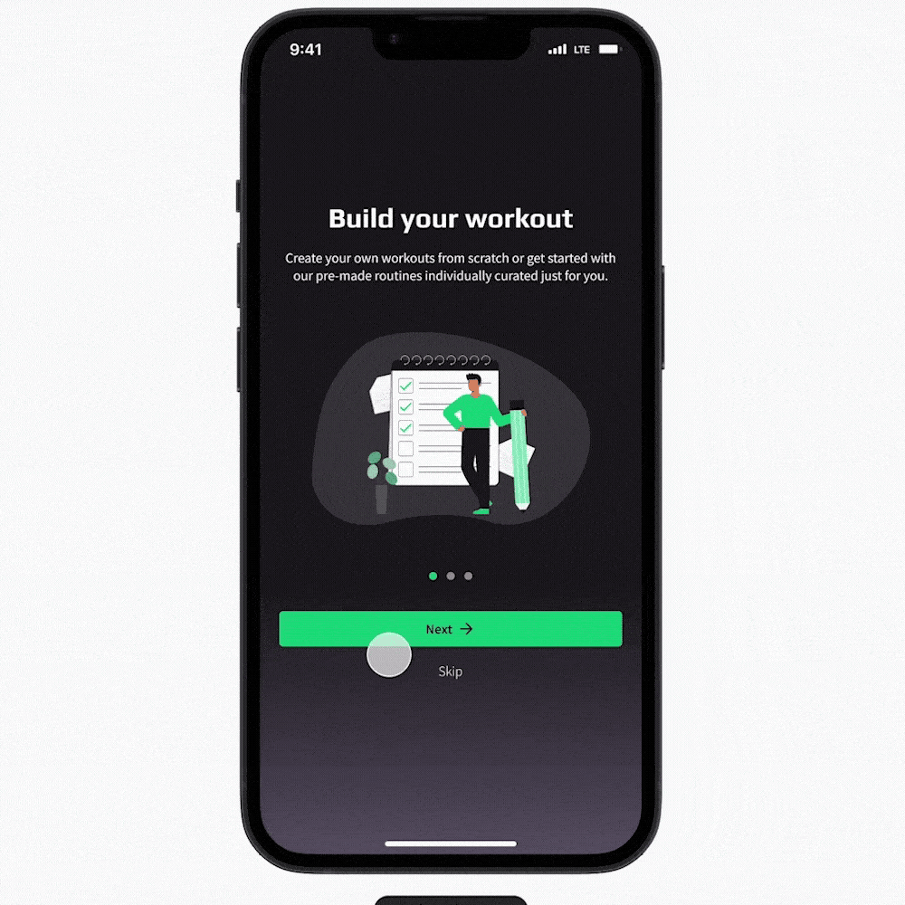
I designed a site map and user flows to structure the app around Derek’s needs and the client’s priorities. Key screens included onboarding, Home, workout creation, exercise library, workout history, and profile.
User flows accounted for different entry points and tasks like creating, completing, and sharing workouts. I also explored how AI-generated plans could fit into the experience later with minimal disruption.


🎨 Design
Sketches
Early sketching helped define key flows and simplify the user journey—reducing friction in workout creation, exercise lookup, and progress tracking.

The Home screen was optimized for quick access to recent workouts, with a floating “Create Workout” button that kept primary actions front and center.
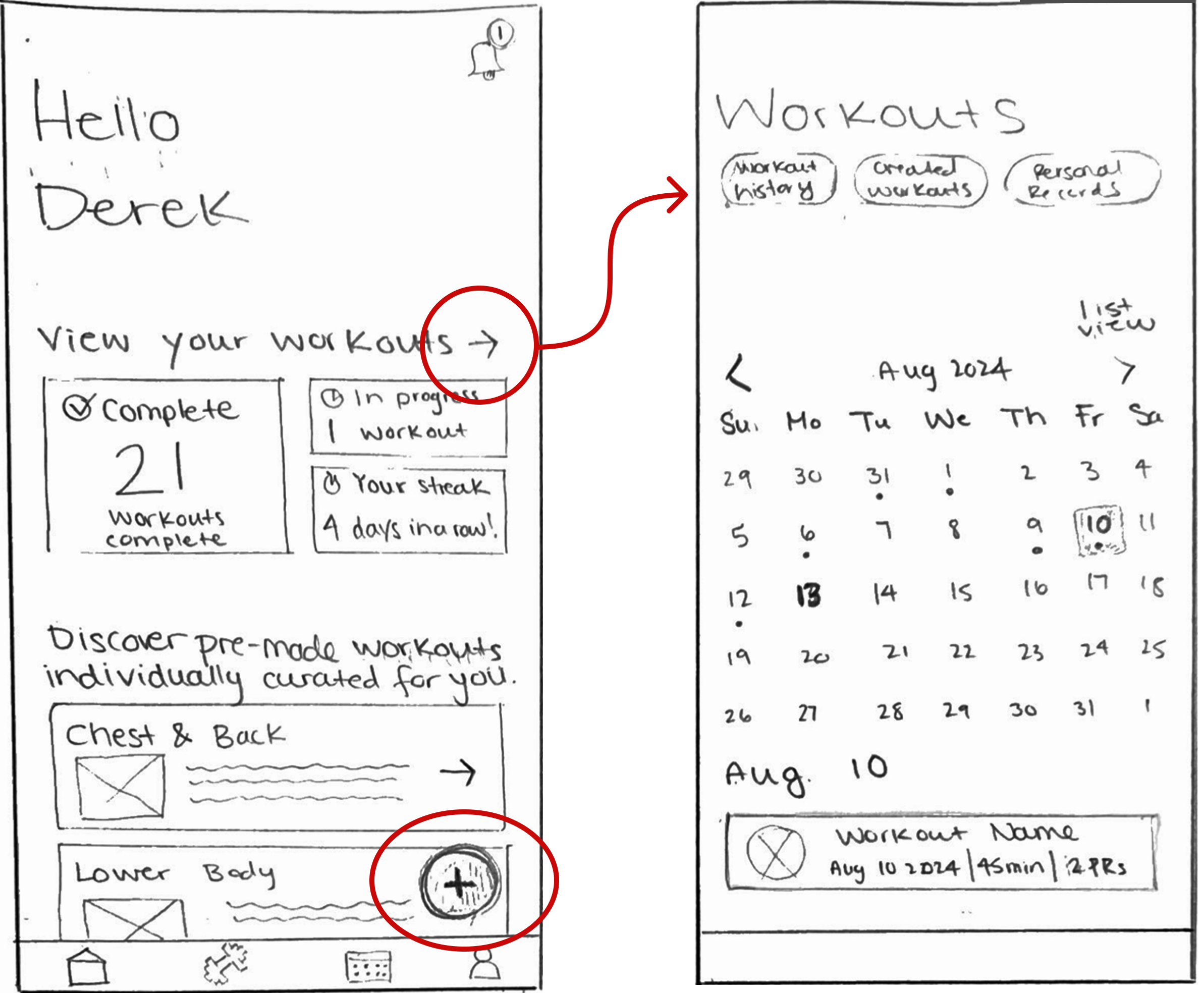
The Exercise Library allowed users to explore movements, view form cues, and log personal records—all in one place.

To support the client’s emphasis on community, I integrated social sharing directly into each workout and designed a Notifications hub for updates like shared workouts and friend requests.


These sketches laid the foundation for an interface that prioritized clarity, control, and connection.
Branding & UI
To reflect the client’s vision of an energetic, modern fitness experience, I chose a dark theme with a vibrant blue-green accent—a color that communicates growth, momentum, and stands out against darker backgrounds.
Typography combined Source Sans Pro for clean readability with Play for personality and visual contrast in headings.
Visual hierarchy and contrast were designed with accessibility in mind, helping users stay focused and engaged.

High-fidelity wireframes
The final high-fidelity screens translated sketches into a polished, functional interface. Key flows included onboarding, workout creation, exercise exploration, and community features—designed to scale across fitness levels and screen sizes.

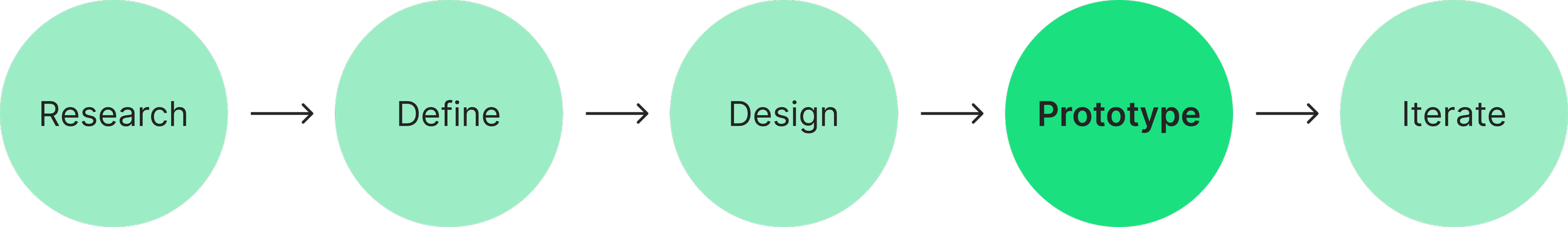
🧩 Prototype
Testing the user journey
Prototyping brought the wireframes to life, giving the client a tangible sense of the product’s look and feel.
This hands-on step helped align expectations, surface usability issues early, and validate whether the design effectively supported both user needs and the client’s vision.

What worked, what didn’t
Successes:
The client found the overall flow intuitive and engaging. Aside from minor UI adjustments, key interactions were clear, consistent, and aligned with the intended user journey.
Areas for growth:
Client feedback led to two key feature additions: shared workouts for collaboration and recurring workouts to support habit-building and long-term engagement.

🔄 Interate
Improvements & revisions
In response to client feedback, I designed two additional user flows—collaborative workouts and recurring workout scheduling—to enhance engagement and support long-term use.
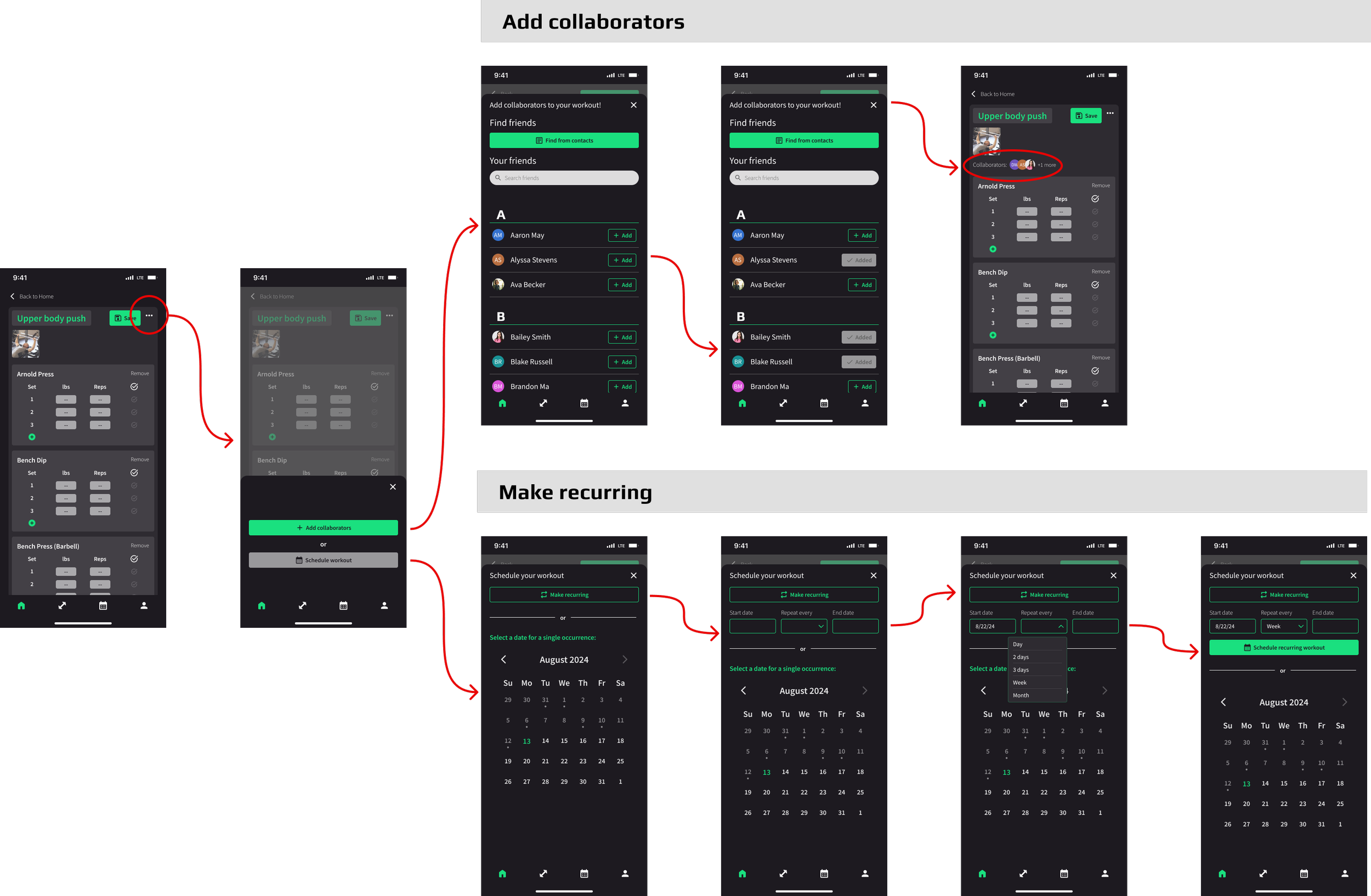
Final Prototype
Final Thoughts
🧠 What I learned
This project reinforced the value of clear communication and balancing user needs with technical feasibility. Leading the full design process, I made user-centered decisions and improved my skills in delivering clear, developer-ready handoffs aligned with the product vision.
⏳ If I had more time…
I would conduct additional usability testing to validate and refine the design further. More time would also allow deeper exploration of AI integration to enhance personalization and workout planning in line with user needs.